What is a Zenphi Dashboard?
a powerful feature designed to help you visualize, monitor, and act on data collected through your Zenphi workflows — particularly from Zenphi Tables. Whether you're presenting data to internal stakeholders or sharing it externally with customers or partners, Dashboards offer a flexible and interactive way to surface meaningful insights and trigger actions in real time.
Definition
A Zenphi Dashboard is a customizable space where you can organize and display various widgets (charts, tables, metrics, etc.) — each pulling data directly from a Zenphi Table. Dashboards provide a clear visual summary of your workflow’s data and performance, helping teams monitor progress, spot trends, and take quick action where needed.
Each Dashboard is made up of pages, and each page can contain multiple widgets. Dashboards can be shared with others across your organization or externally with Viewer-role users such as customers or partners.
🔑 Key Capabilities
-
Visualize Data from Zenphi Tables
Display your automation data through a range of widgets: tables, charts, metrics, calendars, and more.
Customize which columns or fields to show and apply filters or conditions to focus on what matters most.
-
Multiple Dashboard Pages
Organize your data across multiple pages in a single dashboard to separate topics, use cases, or audiences.
-
Interactive Widgets
Widgets aren’t just for viewing — users can interact with records, including adding, editing, or deleting rows if permissions allow.
-
Action Buttons
Embed Run Flow within row-based widgets (like a Grid or List) to trigger flows, submit forms, or run operations tied to a specific record.
These buttons are connected to flows that start with the “Table Action” trigger, automatically passing the selected row’s data into the flow.
-
Detail Pages
Set up Detail Pages linked to specific widgets for a deeper view into individual records.
Users can click into a row to view more information or perform record-specific actions — like updating values, approving requests, or viewing history.
-
External Sharing (View-Only Access)
Dashboards can be shared with external stakeholders (e.g., clients, vendors, partners) using the Viewer role, giving them access to specific data without exposing your flows or backend setup.
-
Real-Time Reporting
Use Dashboards as live reports to track workflow performance, task completion, inventory levels, form submissions, and more — all updated dynamically based on the data in your Zenphi Tables.
🧩 How Dashboards Fit in the Zenphi Ecosystem
Zenphi Dashboards sit at the intersection of:
- Zenphi Tables, where your automation data is stored.
- Zenphi Forms, which feed that data into the tables.
- Zenphi Flows, which can be triggered directly from dashboard actions.
Together, they create a closed-loop system: data is collected, monitored, and acted upon — all from within your Zenphi environment.
Example Use Cases:
1. Inventory Monitoring
Use dashboards to track product quantities, stock levels, and restock alerts from Zenphi Tables — ideal for operations or warehouse teams.
2. Employee Onboarding Status
Visualize onboarding progress across departments or roles with charts grouped by status, location, or manager.
3. Customer-Facing Reports
Share a curated dashboard view with customers or partners (via Viewer Role) to show project updates, order statuses, or service performance.
4. Request Approvals
Embed Action Buttons in table rows to trigger flows where users can submit, approve, or reject requests — such as time-off, purchases, or travel.
5. Executive Summary & KPIs
Display high-level metrics like workflow completion rates, SLA performance, or approval turnaround time — updated live from Zenphi Tables.
6. Form Submissions Overview
Track and filter submitted Zenphi Forms (e.g., expense claims, IT tickets) and review data quickly in tabular or visual formats.
7. Workflow Control Center
Add buttons that let you manually trigger flows (e.g., send reminders, escalate tasks) directly from a dashboard — without going into the Flow Editor.
8. Detailed Record Exploration
Enable Detail Pages to let users click into a row and see full record information (e.g., all form fields, attached files, notes).
9. Self-Service Operations
Let internal teams (like HR or Finance) interact with records — edit data, update statuses, or take corrective actions — without needing Zenphi access training.
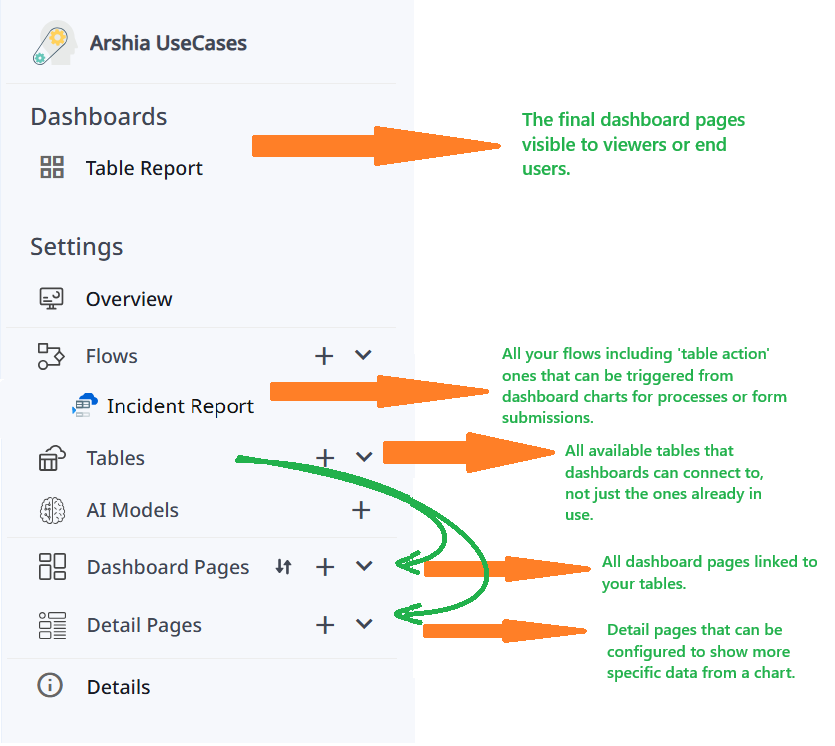
📍 Where to Find Dashboards
When you open a space, if you are a Viewer, the Dashboards for that space will be the only visible section.
If you have other roles, you'll see a left-hand sidebar containing Dashboards along with other workspace items like Flows and Tables.
🧩 What Are Dashboard Widgets?
Widgets are the core building blocks of a Zenphi Dashboard. They visually display data pulled from your Zenphi Tables in various formats, helping you understand and act on information at a glance. Each widget serves a different purpose—some are focused on visual summaries like charts or metrics, while others show detailed or interactive views like tables, lists, or calendars.
Widgets are interactive and customizable. You can choose what data to show, how it’s grouped, whether it's clickable, editable, or linked to Detail Pages or Action Buttons for further actions such as launching flows or opening forms.
Two Main Categories of Widgets
Widgets in Zenphi generally fall into two categories:
- Visual (Metric-Based) Widgets – Best for summaries and performance insights.
- Record-based Widgets – Designed to present detailed, record-level data (and support interaction like editing, deleting, running flows, etc.).
Let’s look at all available widget types:
📊 Series Chart (Visual)
- Displays data trends over time or grouped by categories.
- Great for tracking changes like monthly submissions, sales volume, or request statuses.
- Supports line, bar, and column variations.
🥧 Pie Chart (Visual)
- Breaks down your data into segments of a circle.
- Perfect for showing proportions—like request statuses, category distributions, or workload splits.
- Simple and effective for at-a-glance understanding.
📋 Grid (Record-based)
- A table-style widget showing multiple columns and rows from your Zenphi Table.
- Supports inline editing, record deletion, and adding records directly.
- Can include Action Buttons and link to Detail Pages.
- Useful for inventories, request lists, task tracking, etc.
🗂️ Kanban (Record-based)
- Displays data grouped by status or category in columns (e.g., "To Do", "In Progress", "Done").
- Lets users drag and drop cards between stages for process management.
- Ideal for workflows like ticketing systems, task progress, or onboarding pipelines.
📄 List (Record-based)
- Shows your records in a simplified list format—clean and easy to scan.
- Good for compact overviews where you don’t need a full grid but still want row-by-row data.
- Can also support Action Buttons and link to Detail Pages.
📅 Calendar (Record-based)
- Plots your data on a calendar based on a date field (e.g., due date, creation date).
- Great for viewing deadlines, event schedules, and task timelines.
- Makes time-based planning more visual and intuitive.
🔢 Metric (Visual)
- Displays a single, key number from your data.
- You can show counts (e.g., number of open requests), sums, averages, etc.
- Very useful for quick insights and performance indicators.
⏲️ Gauge (Visual)
- A circular chart that shows a value within a range, like a speedometer.
- Helps visualize progress, utilization, or goal completion (e.g., "80% quota used").
- Supports threshold coloring for better emphasis.
🌐 Web (Embedded)
- Embeds a web page or external resource directly inside the dashboard.
- Can be used to display documentation, charts from external tools, or even Google Slides.
- Not tied to Zenphi data—purely for reference or embedded content.
⚙️ Action Buttons in Dashboards
Action Buttons make your dashboards interactive.
They allow you to take action directly from the data shown in your row-based widgets or detail pages—whether it's running a workflow, opening a form, or navigating to a more detailed view of a specific record.
Where Do Action Buttons Appear?
You can add Action Buttons in two places:
- Row-Based Widgets (e.g., Grid, List, Kanban, Calendar)
- Detail Pages (dedicated views for individual rows)
Once configured, a three-dot menu (⋮) appears next to each row/item in the widget. Clicking on it reveals the actions tied to that specific record.
Two Types of Actions You Can Set
You can attach either or both of the following to a row:
1. ▶️ Run Flow
You can configure an Action Button to run a Zenphi Flow.
The flow must start with a “Tables - Action” trigger.
- This special trigger lets a flow receive the full data of the clicked row.
- You can also attach a Zenphi Form to collect more input before launching the flow.
Once created and published, your flow will appear in the dropdown when adding an Action Button to your widget or detail page.
This is useful for:
- Submitting approvals or requests.
- Triggering escalations or alerts.
- Modifying table data (e.g., updating stock quantity).
Reference: Learn more about the “Tables - Action” trigger (Insert actual documentation link here.)
2. 🔍 Open Detail Page
- You can link a record to a Detail Page—a full dashboard page customized to show detailed information for one single row.
- You can use widgets again (Grids, Metrics, Text, etc.), and even add Action Buttons inside the detail page, including flow triggers.
- This creates a smooth experience: the user clicks a row in the main dashboard, and they’re taken to a detail view tailored for that record.
Example: How It Works
Let’s say you're managing an inventory dashboard:
-
You have a Grid Widget showing product records.
-
Next to each product, a ⋮ button appears.
-
Click it and you’ll see:
- ✅ “Update Stock” (runs a flow with a form to modify stock and price)
- 🔎 “View Details” (opens a detail page showing full specs, supplier info, and a second button for reordering)
Setting Up Action Buttons
Here’s how it works in practice:
-
Inside your widget settings (or detail page):
-
Go to the "Action Buttons" section.
-
Choose between:
- Run Flow: Select a previously published flow using “Table Action” trigger.
- Open Detail Page: Select from available detail pages in your space.
-
Once set, users will see and use those actions in the three-dot menu for every row.
Notes:
✅ Flows can be triggered from the widget directly OR inside a Detail Page.
✅ You can combine flows and detail pages for powerful multi-step interactivity.
✅ Detail Pages can contain another Detail Page, creating multi-layer navigation.
Multi-Layer Detail Pages – Example Scenario:
Imagine you're managing support tickets:
- In the main Grid, a user clicks the ⋮ menu on a ticket and selects "View Details".
- The Detail Page opens showing full ticket info, customer notes, and an "Escalate" button that runs a flow.
- That page also shows a "More Info" link (another Action Button) to another Detail Page, where the support history or device logs are displayed.
This layered structure makes Zenphi dashboards incredibly flexible—allowing you to drill deeper into your data as needed.
📌 Conclusion
Zenphi Dashboards empower you to not only visualize but also interact with your data—whether it's launching flows or diving into record-level detail. Action Buttons are the bridge between data and action, letting you manage and automate processes seamlessly from within the dashboard.
In the next section, we’ll explore each Widget type one by one—how they display data, where they’re best used, and how to configure them effectively. You can use these widgets both in your main Dashboard Pages and within Detail Pages, depending on the experience you want to create.
Updated 5 months ago