Lesson 3: Tables & Dashboards
Build a solid analytics around your process
In the previous lesson, we learned what the Flow is and how to automate a simple document approval process. Now, as our Flow is up and running, we want to know some process analytics, for example:
- how many documents were requested
- how many were approved or rejected;
- how many days does it take to approve one document,
etc.
To build this kind of analytics, we'll use Tables & Dashboards. In this lesson, we'll learn all about it.
Tables
Table is a database where you can store all the important information from your Processes. They work similarly to Google Sheets but integrate better with zenphi and with Tables you can create Dashboards (Charts) automatically.
How to create a Table
Let's take a document approval process example from the previous lesson, and build the zenphi analytics around it. As you remember, the last step of our process was Adding a Row to Google Sheet. Now, let's replace the Google Sheet with the zenphi Table.
Firstly, let's create a Table (click on the "+" near Tables from the left side menu) and add the columns with the document parameters we're interested in (right top corner) just as we did with the Google Sheet.
Note that you should create a Table in the same Space where the Flow from which you want to take the data is located.
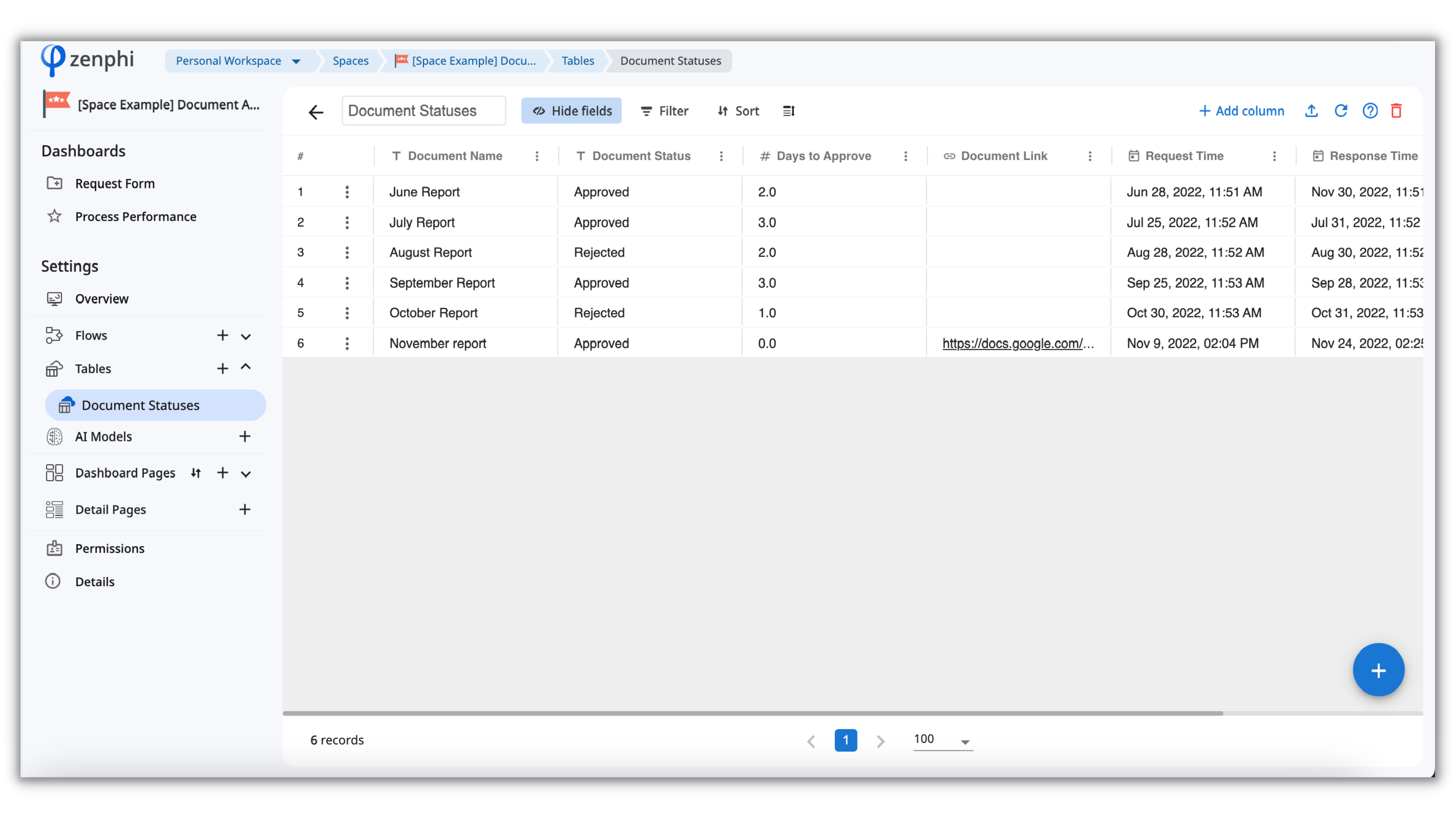
If you want to add a record manually you can click on the big blue plus icon in the right bottom corner. But most of the time, we'll be adding records automatically from the Flow runs. Let's learn how exactly you can do it.
For that let's go back to our Flow and change the "Add Row to Google Sheets" action to "Create a Records in zenphi Table".
Now, let's configure our new Action. Choose a Table you created earlier and select the fields to add to the Table columns. Using the same principle as in our previous lesson, we'll add the data from the Trigger and Actions with the help of Token Picker.
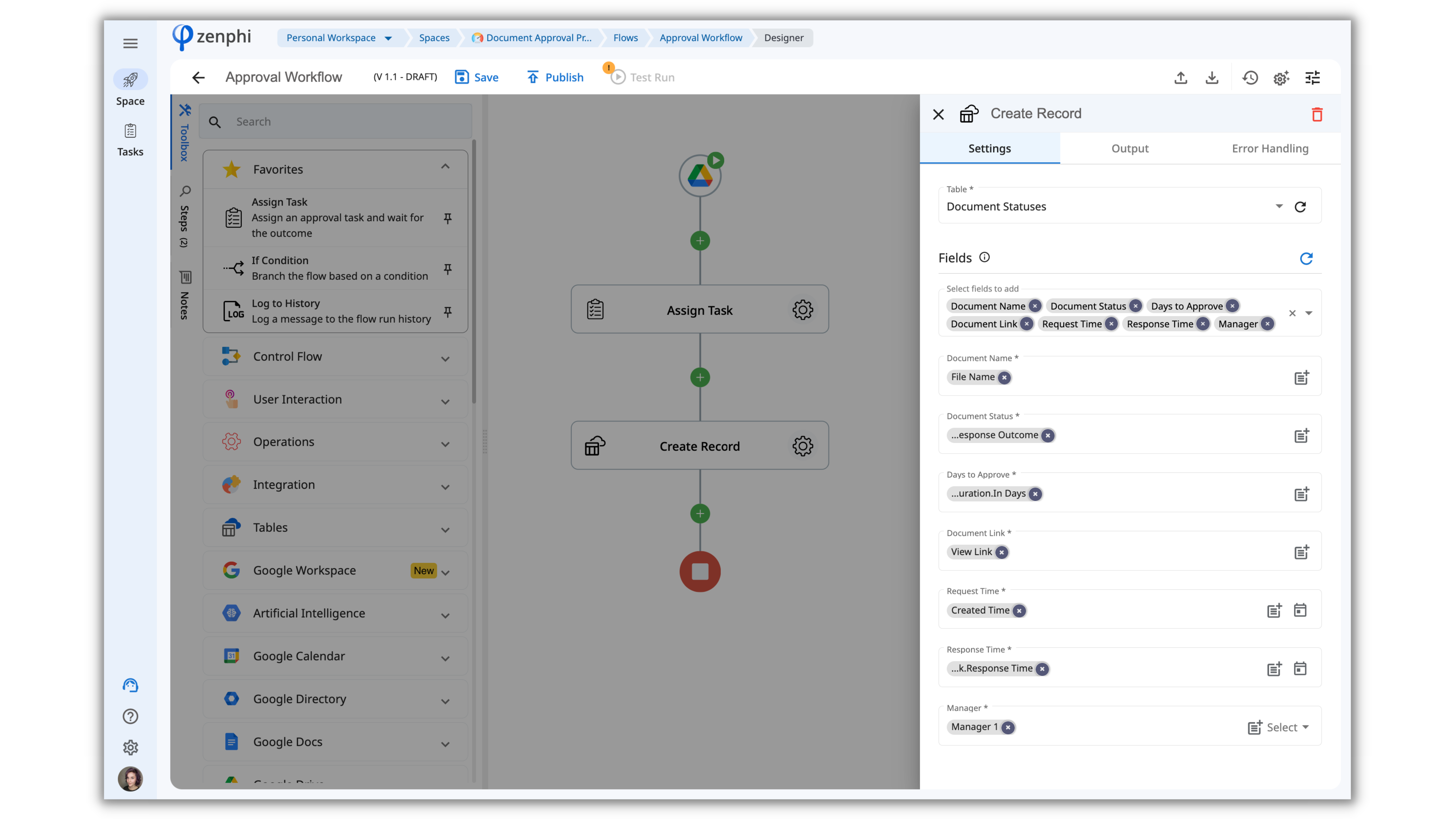
You can Test the Flow to check how it's working.
All done! Now all the process data will be automatically added and safely stored in the zenphi Table. To automatically create charts with metrics from this Table, let's learn how to create Dashboards.
Dashboards
At one point you may need to optimize your process performance. Dashboards will allow you to pull out the key metrics and insights from your processes into Pie Charts, Grids, and other reports.
For example, you will find out:
- Total number of requests;
- The percentage of the documents that are approved and rejected;
- Approval duration;
etc.
The data for these Dashboards is taken from Tables.
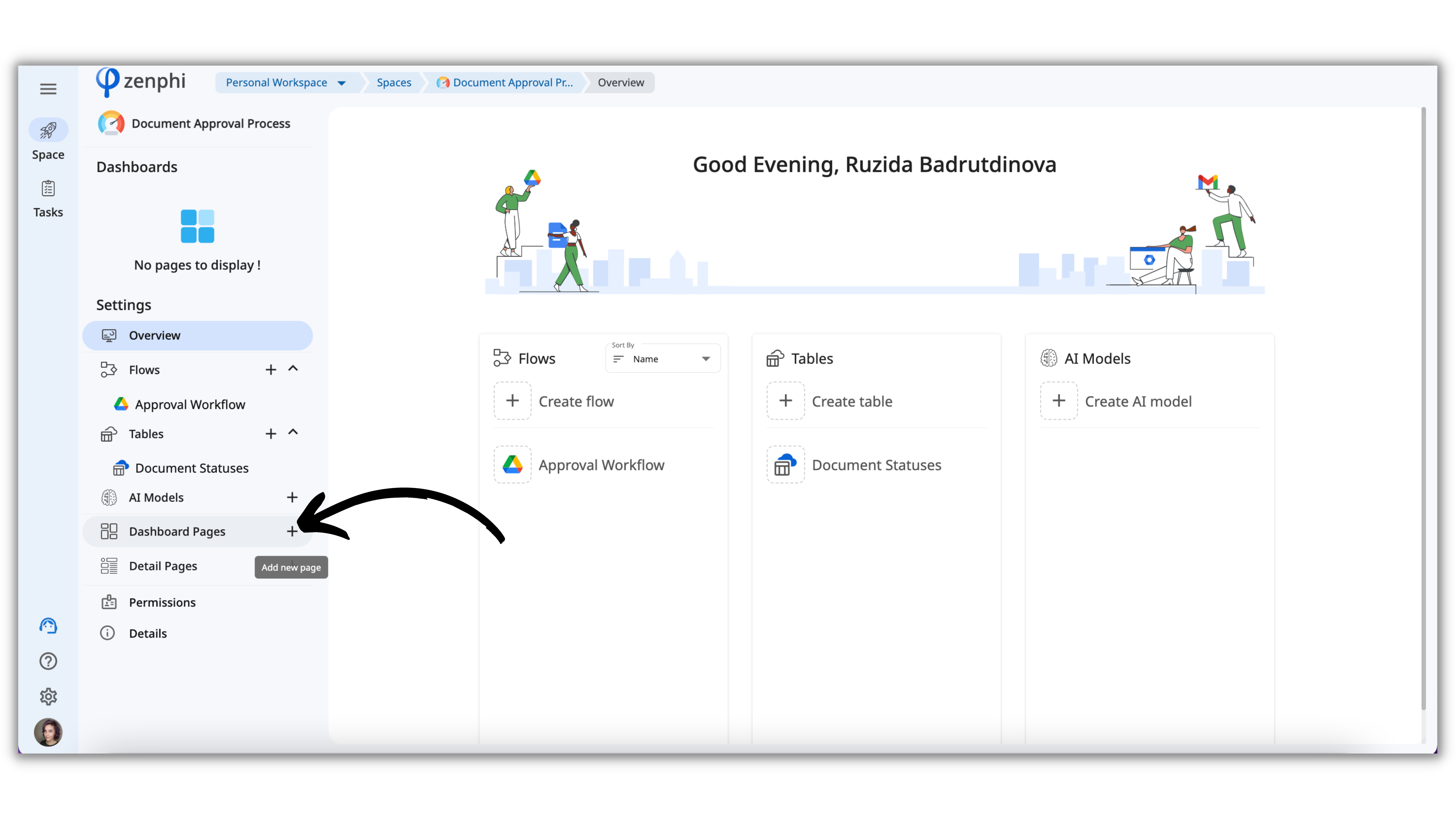
How to create a Dashboard
In your Space click on the plus icon within the "Dashboard Page" tab:
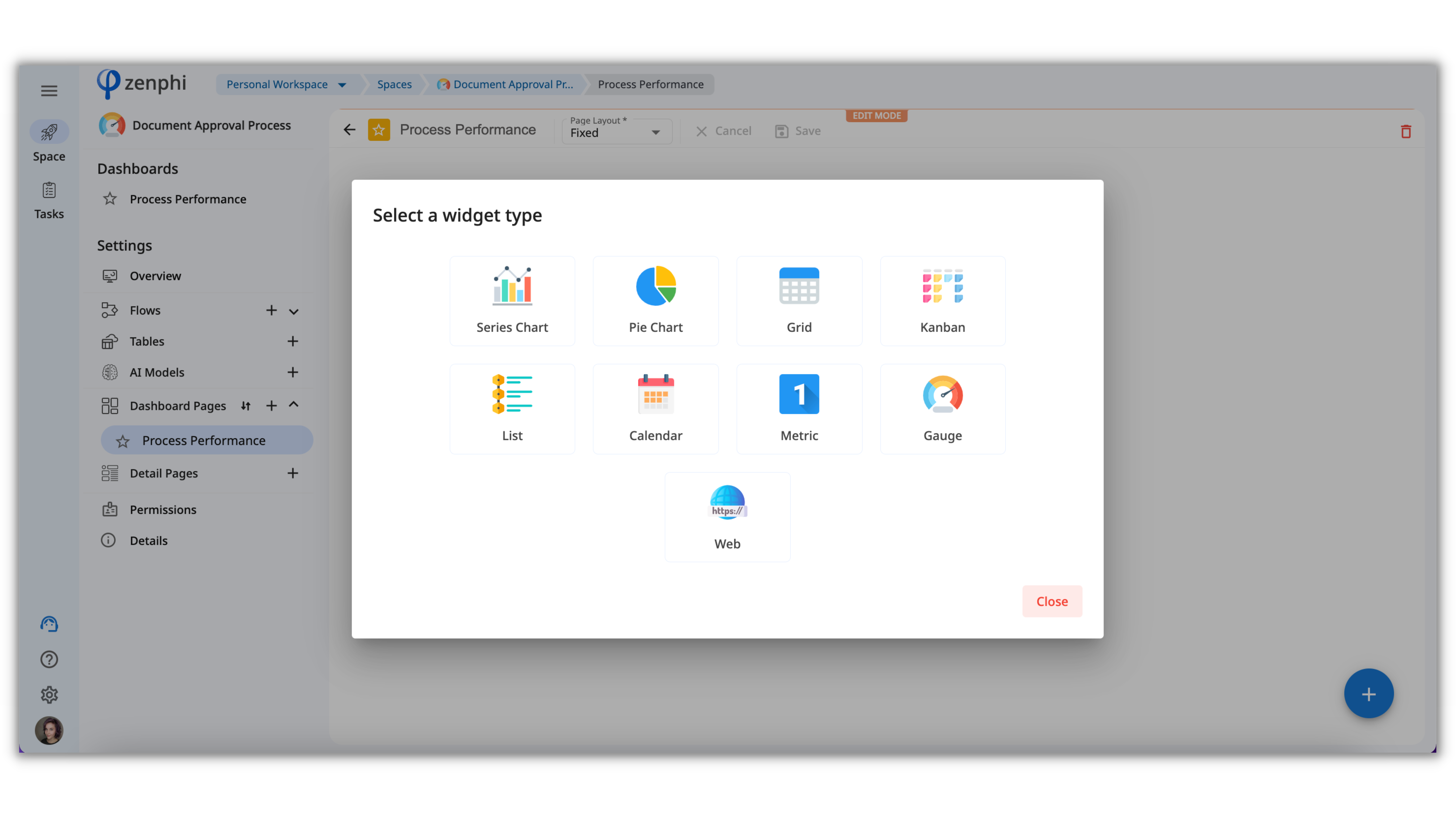
On each Dashboard page, you can create multiple widgets such as Pie Charts, Kanban boards, Lists, Calendars, and more. To create a widget click on a big blue plus icon in the right bottom corner.
Let's create a Series chart together:
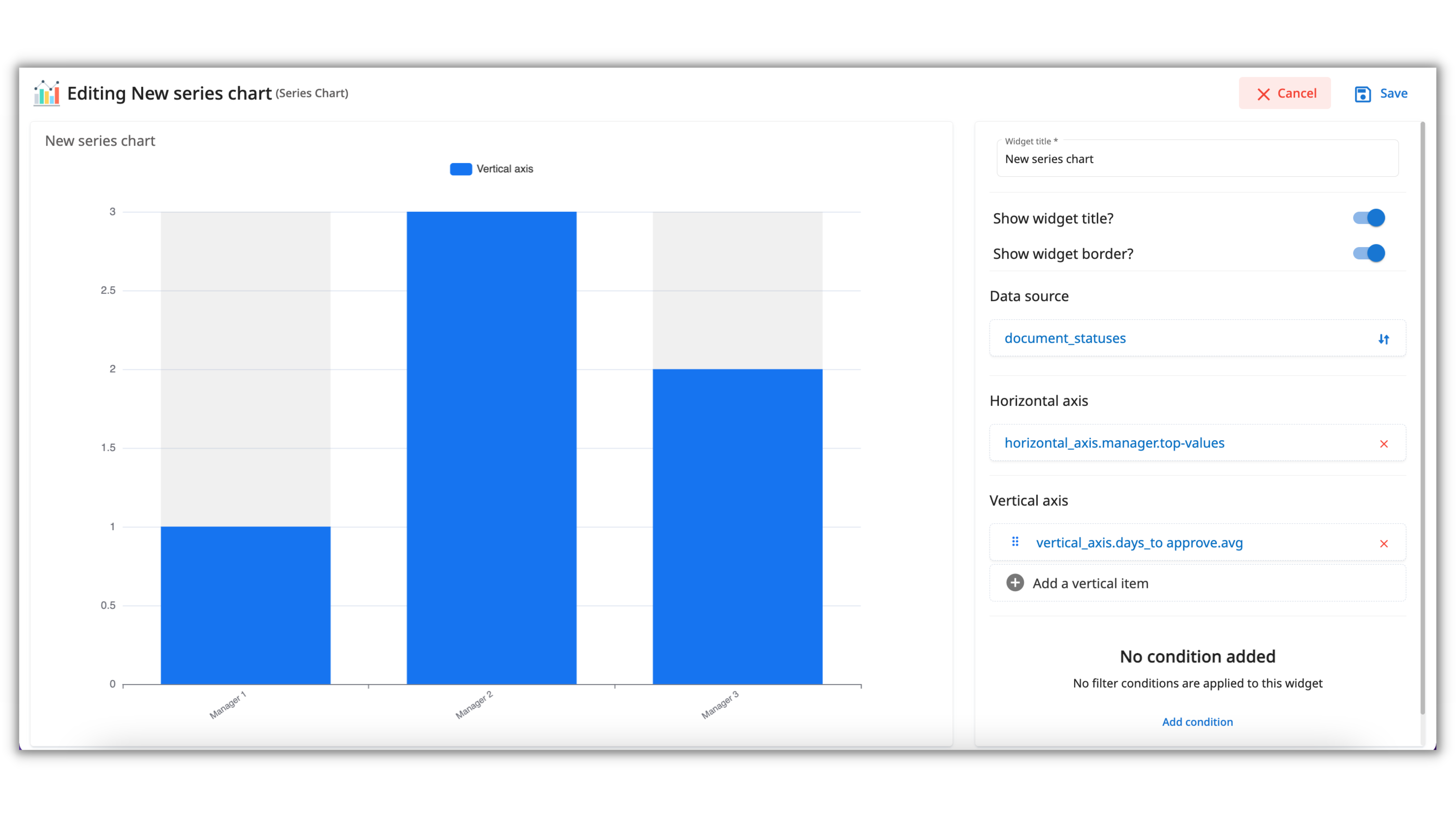
- Name your widget or disable the naming in the field below if needed;
- Data Source - choose the Table from which you want to take the data;
- Horizontal axis - choose Manager field;
- Vertical axis - choose the "Days to approve" field.
Now, the chart shows us who is the best performer among the managers.
Let's create one more widget which is the"Metric":
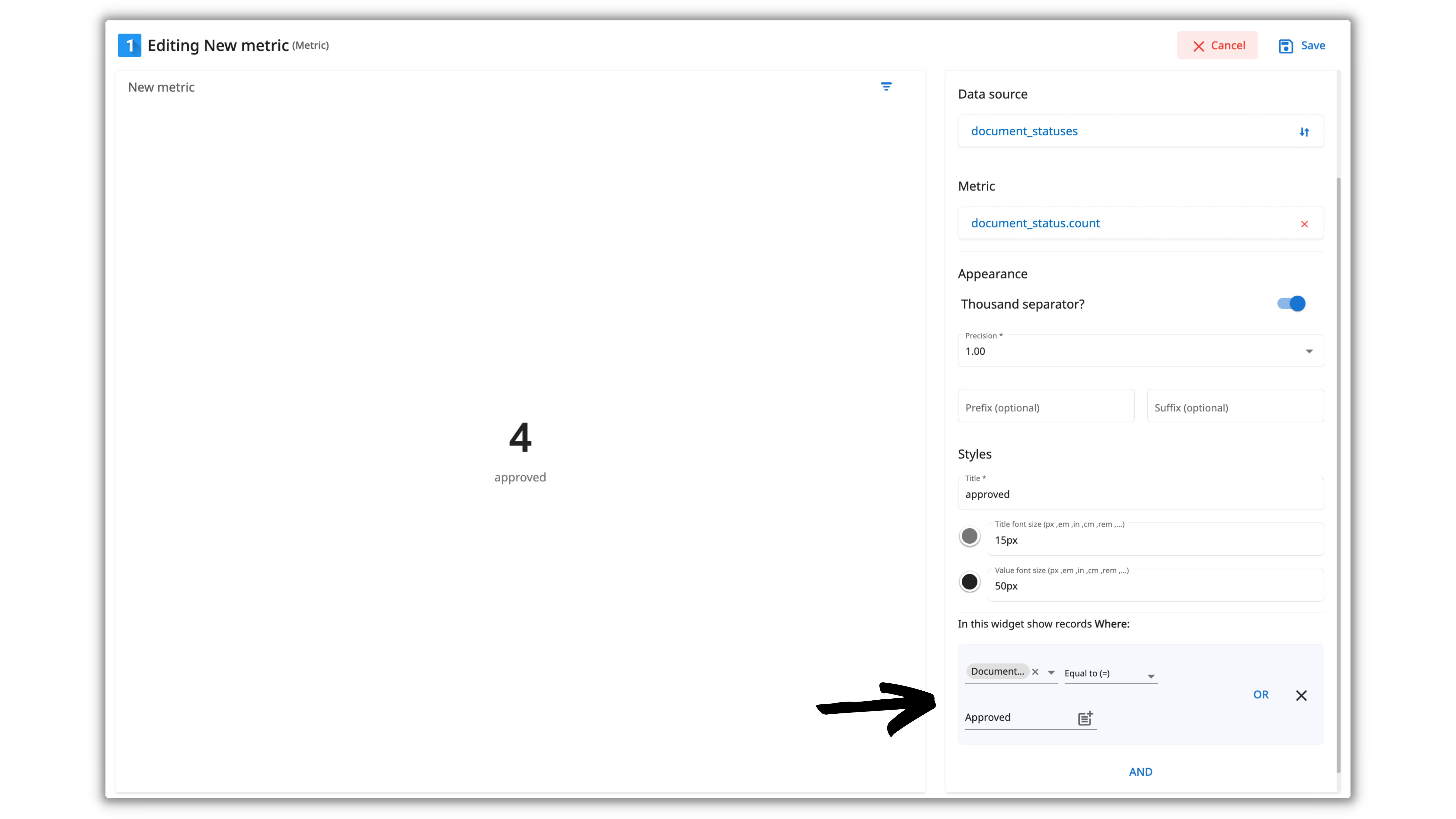
In this widget, we want to display the total number of approved documents. For that, we'll use the same logic as we did with the previous widget, but in the Metric field, let's choose the Document Status.
For this widget to display only the Approved documents and not Rejected ones, we need to add a condition "Document Status Equal to Approved".
Congrats on learning zenphi Tables and Dashboards - now, you can get the analytics from any process and optimize it accordingly.
Watch these YouTube videos to check other Tables and Dashboards use cases.
Updated 10 months ago
In the next lesson, we'll learn what is AI model and how you can streamline your data managing by using it.